Sunday, January 31, 2010


For Northface, this ad by Saatchi & Saatchi is an illustration of the gross monster that "city" can be in opposition to nature. A dinosaur-like monster is created entirely of city material and it dwarfs a small person to the lower left who represents the man looking for the natural outdoors (Northface). I really like the use of black ink only. This simplicity is needed with such a complicated illustration. The illustration engages the viewer on a level similar to the Navia ad below. However, I'm not so sure how appropriate the ad is for the target. The target audience may appreciate and respond better to a simple, direct ad like the Jeep one - also below.
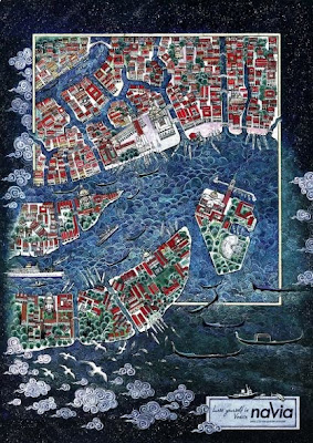


Most ads only demand a split-second glance to communicate an idea. And while this ad for Navia (navigation system) by TBWA explains the product quickly, it will most likely engage the viewer longer. The illustration is a detailed arial view of Venice and it's similar to looking at an amusement park map. People will want to search for the points of interest and see where the roads lead. This is the kind of print ad that should replace band posters in dorm rooms. The tag reads, "Lose yourself in Venice."


The Jeep ad above inventively uses the combined shapes of a camel and husky dog to create a Jeep form. The combination also creates a statement: Jeep combines the endurance of a camel and strength of a husky. Both animals are examples of extreme climates and terrain. The choice of two transparent colors to create a third mixed color helps make a direct statment. The visual subjects also reference road sign language. Ad is by BBDO Proximity, Malaysia.


This Audi A4 ad by Venables, Bell & Partners not only conceptually solid, but visually stimulating. The video walks the viewer into an elegant living room filled with late 19th cent. antiques and window coverings, communicating that a cultured, mature, wealthy person lives here. Then the room quickly transforms into modern luxury with increased sunlight. It's more than the aesthetics - it communicates a lifestyle - a fluffy frou-frou dog becomes a boxer. Finally, the view outside the window to the driveway shows a Mercedes-Benz transformed into an Audi A4. Even the garbage cans behind the car change to recycle bins. The mechanical way by which the scene transforms is awesome, and the message is clear that Progress is good.


This Honda Civic commercial by Weiden+Kennedy is phenomenal, and artful. It uses the voices and conductor from a choir to imitate the everyday/unnoticed sounds a car makes. For example: power windows, rain on car, driving through a tunnel, reving the engine. The choir is unexpectedly placed in a parking garage while Honda clips sync with their performance. The car clips are strong compositionally and so are the angles at which the camera pans the lips and faces of the choir members. It's an intimate experience.